Over the past few months I have attended a number of lectures at college. Each one providing a much needed look into the design industry. Throughout this time we have had a variety of guest lecturers, varying from multi-media film designers such as Tal Rosner and graphic design companies such as Truth, Glorious and Thoughtful. Some of these designers have been from small companies consisting of two or three members, and others were bigger companies with a larger design team. One lecture that I really enjoyed was the one given to us by Glorious.
Glorious are a company that work a lot with branding and Identity. They are identity specialists who are known for their creative thinking and craft skills and were named in the top five of the North of England Design Consultancy of the Year. One of the design directors, Tom Shaughnessy, came to speak to us at college and told us a bit about the company itself. He was very passionate about design and told us that Glorious were about a good idea not just aesthetics. This, in my opinion is what differentiates from an average designer and a great designer, which is why I always try and push myself to come up with a bigger and better idea.
The presentation that Glorious gave us was good as it was great to see the kind of work that was being produced at a top design agency and see the clients that they had worked for. Tom showed us how even top designers have to keep on working to win clients throughout their careers. The design agency Truth also came in to talk to us a few months ago and the presentation that they gave also really stood out to me, maybe even more so than Glorious’. I think that the reason for this is because they came in and explained to us how they worked as a company; it wasn’t just a presentation of a designers work.
Truth are a small, Manchester based company renown for their type and print based work. They believe that for a brand to succeed you must be honest about it which is why they offer straightforward design solutions and an honest approach. Two people, Darren Scott and Jane Kaye, run the company. They each have separate roles, Darren being the Creative Partner and Jane being the Managing Partner. Truth was the first agency that actually told us how the business was run. I found it really interesting to hear how each of them had different roles within the company and how they couldn’t function properly without each other as they both held different skills.
I feel that this also relates to how the company works in a wider sense. The two partners met when working together at McCann Erickson where the team used to do everything ‘in house’, now working at Truth Darren told us that he enjoyed collaborating and working with other artists and designers. He explained how there would always be someone better and more skilled at doing something than you; a professional photographer will produce a better quality photo, an illustrator a better drawing. This is one piece of advice that I will take away with me and hopefully be able to apply to my own work. If I have the best possible resources then my design will be the best it could possibly be.
One thing I picked up on when listening to Darren was that he particularly enjoyed creating typefaces. He showed us a number of these, some that he had worked on outside of Truth and others done for the company. One of the projects that I remember well was for Fuse (Research Studios). I remember this as I have seen the design before while researching Neville Brody for an essay I was writing. When I saw that Darren and Truth had produced work for Research Studios I was really impressed as I learnt a lot about Brody and I see him, as been one of the most influential designers of his time. The Fuse typographic project can be seen below.


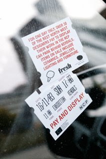
Although Glorious are more of an identity based company they still work with the designing of typography although it is used in a different way. An example of this is the project they had for Red Dog Communications. The type was produced not just for a typeface design but so that they had the best-looking typography for the project in hand. It would dress the logo/identity and make it reach its full potential. Tom took an existing typeface as a template and edited it until he had the desired look. He also created his own type for another project (Pay and Display), an invitation and poster design. He wanted a specific look for the invite he was creating (in the style of a car parking ticket) so he took some graph paper and made his own.


As I mentioned previously although Glorious have been extremely successful in most areas of graphic design they work a lot with logos and are identity specialists. One identity project that they produced that I particularly like was for Twist and Turn, an importer and distributor of extreme sports equipment and clothing. The company wanted a simple, bold logotype that would connect with their target market. I think that the logo produced answers this brief, it is simple yet extremely effective.


An identity project that I like by Truth was one done for the Authentic Food Company. The client wanted a brand identity that would work across various areas of the business. This logo and how it was applied can be seen below.


Although both Truth and Glorious work well in all fields of graphic design I think it is fair to say that each company has its own strengths and tend to work more on certain projects. For example Truth have worked a lot with branding, web design and type whereas Glorious have worked more with identity and branding. This has taught me that when leaving college and going on to hopefully becoming a designer myself that I should work with a company that suits me and what I am good at. Although I know that at this stage in my career I can’t be too choosy!
No comments:
Post a Comment